
New Arrivals
‘Hello I’d Like To Report A Poster Theft’: People Showcase 30 Movie Posters That Are Suspiciously Similar
Jun
Movie posters are supposed to be the grand handshake between a film and its future audience. They whisper, “Come closer, there is drama here,” or shout, “Explosions! Feelings! Someone definitely runs in slow motion!” But every now and then, a poster looks less like a fresh invitation and more like it accidentally wore another movie’s outfit to the party.
That is exactly why the phrase “Hello I’d like to report a poster theft” became such a perfect joke for film fans. Across social media, Letterboxd lists, entertainment blogs, and design circles, people have been pointing out movie posters that look suspiciously similar. Some are so close in composition, color, pose, and mood that viewers do a double take. Others are simply built from the same reliable Hollywood recipe: one lonely figure, one dramatic sky, one blue-orange color palette, and enough floating heads to start a paranormal support group.
This article takes a closer look at why movie posters often resemble each other, when similarity is clever homage, when it feels lazy, and why audiences are so good at spotting the copycat energy. We will also explore real examples, including poster pairings such as Shrooms and Singular Cay, Gravity and Ad Astra, Black Swan and Ghostland, Babel and Savages, and Inception and Geostorm. Grab popcorn. The design police have entered the lobby.
Why Movie Posters Matter More Than People Think
A movie poster is not just decoration. It is marketing, storytelling, branding, genre signaling, and emotional bait rolled into one vertical rectangle. Long before a viewer reads reviews or watches a trailer, the poster may already be doing the heavy lifting. It tells us whether the film is a thriller, romance, superhero spectacle, indie drama, sci-fi epic, horror nightmare, or family comedy where an animal probably talks.
Historically, film posters were among the most important advertising tools for theaters. The classic American “one sheet” format became a standard promotional size, and studios produced posters in multiple dimensions for lobbies, streets, and billboards. Today, posters still matter, even though many people first see them as thumbnails on streaming platforms, social feeds, ticketing apps, and entertainment websites.
That shift has made poster design even more competitive. A poster must work on a theater wall and as a tiny image on a phone screen. It has to communicate quickly, clearly, and emotionally. No wonder designers often return to proven visual formulas. The problem is that when everyone uses the same formulas, the movie poster aisle starts looking like a family reunion where nobody admits they are related.
The Rise of Suspiciously Similar Movie Posters
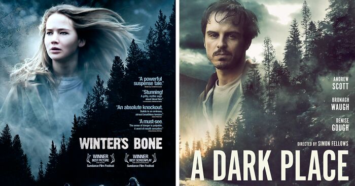
The online fascination with similar movie posters is not new, but it keeps coming back because the evidence is extremely entertaining. Bored Panda’s viral collection of suspiciously similar posters highlighted 30 examples that sparked debate among movie fans. Some viewers saw possible copying. Others argued that many examples were simply common genre conventions, shared visual language, or intentional references.
For instance, Shrooms (2007) and Singular Cay (2012) were compared because of their nearly twin-like visual setup. Gravity (2013) and Ad Astra (2019) share the isolated astronaut-in-space mood. Black Swan (2010) and Ghostland (2018) invite comparison through stark facial imagery and psychological horror energy. Babel (2006) and Savages (2012) became another popular pairing because of their similar arrangement and visual tone. Meanwhile, Inception (2010) and Geostorm (2017) both lean into the massive city-destruction spectacle, giving viewers the sense that someone opened the “apocalyptic urban chaos” folder and clicked “save as.”
Not every similar poster is a scandal. Sometimes the resemblance is coincidental. Sometimes two films share a genre, mood, or central concept, so their posters naturally use similar symbols. Space movies use helmets and stars. Political thrillers use faces split by shadows. Horror films love creepy houses, open mouths, cracked glass, and people standing alone in fog because apparently fog has an excellent agent.
Why Hollywood Keeps Reusing Poster Formulas
Movie marketing is expensive, and risk is not exactly Hollywood’s favorite snack. Studios often spend huge sums promoting major releases, so they tend to favor visual strategies that already work. If a poster style helped sell a successful film, similar compositions may appear again and again.
This is how poster clichés are born. Romantic dramas often use close-up faces, couples leaning into each other, or lovers separated by negative space. Action films love a hero facing away from the viewer while holding a weapon, looking toward fire, smoke, or a city that is clearly having a terrible afternoon. Comedies often place characters against bright backgrounds with exaggerated expressions. Horror posters rely on darkness, sharp contrast, distressed typography, and one unsettling visual hook.
The audience may roll its eyes, but these formulas exist because they communicate instantly. A viewer does not need a paragraph to understand that a poster with a lone figure in a spacesuit suggests isolation, survival, and cosmic danger. A half-lit face tells us secrecy, moral conflict, or psychological tension. A group of characters arranged in a dramatic triangle signals ensemble adventure. The design may be predictable, but it is efficient.
Copycat, Homage, or Genre Language?
The tricky question is whether similar movie posters should be called copycats. The honest answer is: sometimes yes, sometimes no, and sometimes the poster is just standing suspiciously near the cookie jar.
When It Looks Like a Copycat
A poster starts to feel like a copycat when multiple elements line up too neatly: the same central pose, same object placement, same color grading, same typography style, same lighting pattern, and same emotional message. If viewers can place two posters side by side and immediately say, “Wait, did one of these borrow the other’s homework?” the resemblance becomes difficult to ignore.
That does not automatically mean illegal copying. Copyright law can protect visual art, but general ideas, broad concepts, and common genre conventions are not the same as copying a protected work. A poster of an astronaut floating in space is not automatically infringement just because another movie once used an astronaut floating in space. But if a design copies highly specific creative choices, the conversation becomes more serious.
When It Is an Homage
Some posters intentionally reference older posters as a wink to film fans. For example, a horror sequel, parody, or genre-savvy comedy may recreate a famous composition to signal respect or satire. In those cases, the similarity is the point. The viewer is supposed to notice. It becomes part of the joke, tribute, or cultural conversation.
Take comparisons such as The Breakfast Club and The Texas Chainsaw Massacre 2. A resemblance can be read as deliberate because the latter poster plays with the cultural recognition of the former. In cases like that, accusing the poster of theft may miss the fun. It is not sneaking out the back door with stolen art; it is walking through the front entrance wearing a costume and shouting, “Yes, you caught me!”
When It Is Just Genre Language
Some visual similarities are unavoidable because genres build their own vocabulary. A revenge thriller needs intensity. A superhero ensemble needs hierarchy. A sci-fi epic needs scale. A romantic drama needs emotional proximity. A murder mystery needs secrecy, suspects, and probably one character staring as if they know where the body is hidden.
Designers use these cues because audiences understand them. The risk is that efficient visual language can become visual wallpaper. When every poster in a category uses the same lighting, color, pose, and layout, the work stops feeling like communication and starts feeling like a template with better cheekbones.
Common Movie Poster Clichés That Keep Coming Back
Once you notice poster clichés, you cannot unsee them. They are everywhere, quietly multiplying like cinematic gremlins. Here are some of the most common patterns behind suspiciously similar movie posters.
1. The Floating Heads Formation
This is the blockbuster classic. Big stars hover over a smaller action scene, often arranged by fame, importance, or contract negotiation power. The floating heads poster tells audiences, “Look who is in this!” It is especially common in superhero films, fantasy adventures, franchise sequels, and prestige ensemble dramas.
2. The Lone Figure From Behind
A person stands with their back to us, facing a landscape, city, battlefield, doorway, or disaster. It creates mystery and scale. It also allows the viewer to imagine stepping into the character’s place. Westerns, action films, fantasy adventures, and thrillers use this one constantly.
3. Blue and Orange Everywhere
The blue-orange palette became a modern poster staple because the colors contrast strongly and create cinematic energy. Blue can signal night, technology, danger, or melancholy. Orange adds fire, skin tone, heat, or urgency. Together, they scream “expensive movie incoming.”
4. The Big Face With Tiny People
A huge face dominates the poster while smaller figures or scenes appear beneath it. This approach works for thrillers, dramas, and mysteries because it combines character psychology with plot tension. It also gives studios plenty of space to showcase a bankable star.
5. The Cracked Face or Split Face
Psychological thrillers and horror films love fractured faces, mirrored faces, masked faces, and half-shadowed faces. These posters visually announce identity problems, hidden evil, trauma, obsession, or “someone should really call a therapist before act three.”
Real Examples That Started the “Poster Theft” Conversation
Some of the most memorable examples from online discussions are not necessarily legal cases or confirmed copying. They are visual comparisons that made audiences laugh, argue, and zoom in like detectives with Wi-Fi.
Shrooms vs. Singular Cay: This pairing sits near the top of many suspicious poster lists because the overall composition looks unusually close. The comparison is a perfect example of why fans use the word “theft” jokingly, even when they are not making a legal claim.
Gravity vs. Ad Astra: Both films involve space, isolation, and existential danger, so some similarity is expected. Still, when two posters rely heavily on a lone astronaut image, the comparison practically writes itself. Space may be infinite, but poster ideas sometimes seem to orbit the same moon.
Black Swan vs. Ghostland: These posters lean into psychological unease through close-up facial imagery and dramatic contrast. The resemblance feels less like a direct duplicate and more like two films speaking the same visual dialect of dread.
Babel vs. Savages: This comparison shows how composition, character arrangement, and mood can create a strong sense of déjà vu. It also demonstrates how serious dramas and crime stories often use layered faces and stark arrangements to suggest interconnected lives or moral chaos.
Inception vs. Geostorm: Both posters present a large-scale urban disaster image, using city architecture as visual spectacle. One is a mind-bending dream thriller; the other is a climate-disaster action film. Different stories, similar “the city is absolutely not okay” energy.
Why Audiences Love Calling Out Similar Posters
Part of the appeal is simple: spotting similarities feels like solving a tiny mystery. The human brain loves pattern recognition. When we notice two posters using the same pose, lighting, and composition, we get a satisfying little “aha” moment. It is like finding a hidden object, except the hidden object is Hollywood’s recycling bin.
There is also a sense of playful justice. Movie marketing can feel glossy, expensive, and untouchable. When regular viewers point out that two posters look strangely alike, they get to puncture the glamour for a second. It is not mean-spirited by default; often it is affectionate teasing from people who love movies enough to notice the details.
Of course, the conversation can become sharper when viewers believe a smaller film’s design was copied by a bigger production, or when an independent artist’s work resembles a studio campaign too closely. In those cases, the joke turns into a serious discussion about creative credit, originality, and the power imbalance between artists and entertainment companies.
The Design Challenge: Originality Inside a Tiny Rectangle
Creating an original movie poster is harder than it looks. The designer must satisfy filmmakers, producers, distributors, actors, agents, marketing departments, international partners, and sometimes a committee whose main design note is “make it pop,” which is not a note so much as a small weather event.
A poster must show the title clearly, feature key cast members, match the film’s tone, appeal to the target audience, work across formats, and survive endless approvals. If the movie stars famous actors, their faces may need to appear prominently. If it belongs to a franchise, branding rules may limit experimentation. If the release date is near, the design team may have little time to reinvent the wheel.
That pressure explains why templates are tempting. But the best posters prove that familiar elements can still feel fresh. A strong poster does not always need a brand-new concept. Sometimes it only needs a surprising crop, a sharper color decision, a more memorable type treatment, or one image that captures the soul of the story instead of just the genre label.
How Filmmakers and Designers Can Avoid Poster Déjà Vu
The first step is research. Before approving key art, teams should compare the design against posters from the same genre, same decade, and same visual concept. If the poster already has five cousins, maybe it needs a new haircut.
Second, designers should identify the film’s unique emotional hook. What makes this story different from every other thriller, romance, horror film, or sci-fi drama? Is it a specific location, object, relationship, fear, joke, or visual motif? The more specific the concept, the less likely the poster is to become generic.
Third, typography deserves more attention. Many posters rely too heavily on imagery and treat the title like a necessary label. But custom lettering, unusual spacing, or a distinctive type hierarchy can separate one poster from a crowd.
Finally, marketers should remember that safe is not always memorable. A poster that looks like every other successful poster may avoid risk, but it also risks disappearing. The goal is not to be weird for the sake of weird. The goal is to be recognizable, emotionally accurate, and visually ownable.
Are Similar Movie Posters Always Bad?
No. Similarity can be useful, funny, intentional, or even necessary. Genre design works because audiences understand visual shorthand. A horror fan wants to know they are being invited into horror. A romantic-comedy fan wants warmth, chemistry, and charm. A superhero fan wants scale and stakes. Familiarity helps people make fast choices.
The problem comes when familiarity becomes creative autopilot. If a poster says nothing specific about the movie, it becomes interchangeable. And if audiences can swap the title with another film without noticing, the campaign has missed an opportunity.
The best movie posters balance clarity and surprise. They tell us what kind of film we are getting, but they also offer a detail we have not seen a hundred times before. That is why iconic posters last. They become visual memories, not just advertisements.
Personal Experience: What Similar Movie Posters Teach Us About Looking Closely
Once you spend enough time comparing movie posters, watching films becomes slightly more dangerous. Not dangerous in the “car chase through a fruit stand” sense, but dangerous because you start noticing design patterns everywhere. Suddenly, every thriller poster with a lonely road looks related. Every action poster with a hero facing away from the camera starts to feel like it belongs to the same dramatic back-muscle cinematic universe.
The funny part is that this does not ruin movies. In many ways, it makes them more interesting. Similar posters teach us how visual marketing trains our expectations. Before we read a synopsis, we already understand certain signals. A small figure in a huge landscape tells us isolation. A face split by shadow tells us conflict. Red text on a black background tells us danger, passion, or a graphic designer who has chosen war. These choices work because they tap into shared cultural instincts.
Looking at suspiciously similar posters also makes us more sympathetic toward designers. It is easy to laugh and say, “They copied that!” But the real process behind film marketing is often crowded, rushed, and heavily controlled. A designer may begin with ten brilliant concepts and end with the safest option because every stakeholder wanted something slightly different. One person wants more star power. Another wants the villain included. Someone else wants the dog bigger. By the end, the poster may look like a committee meeting wearing Photoshop.
Still, audiences are right to ask for better. Movie posters are part of film culture. They hang in bedrooms, theaters, bars, offices, dorm rooms, and collectors’ archives. A great poster can outlive a mediocre movie. Sometimes people remember the poster more vividly than the plot. That gives poster design real cultural power.
There is also joy in the detective work. Comparing Gravity and Ad Astra, or Black Swan and Ghostland, is not just about catching similarities. It is about understanding how visual ideas travel. A design choice can become a trend, then a convention, then a cliché, then a meme. The internet speeds up that cycle. What once might have been noticed by a few film nerds in a video store can now become a viral post within hours.
For writers, designers, marketers, and film fans, the lesson is valuable: originality is not always about inventing something from nothing. Often, it is about combining familiar ingredients in a way that feels specific, honest, and alive. A movie poster can use shadows, faces, bold color, or dramatic scale without feeling copied. The difference is intention. When every element supports the story, the poster feels designed. When every element simply imitates a trend, it feels borrowed.
So the next time you see a movie poster that looks strangely familiar, enjoy the moment. Squint at it. Search your memory. Ask whether it is homage, coincidence, cliché, or a full-blown case for the fictional Poster Police Department. Then remember that even suspiciously similar posters can teach us something about creativity: everyone is working with the same visual language, but the best artists still find a way to say something unmistakably their own.
Conclusion
The internet’s obsession with suspiciously similar movie posters is more than a joke about Hollywood running out of ideas. It reveals how film marketing works, how genres communicate, and how audiences have become sharper visual readers. Some poster similarities are harmless. Some are intentional tributes. Some are the result of common design formulas. And yes, a few make you want to pick up the phone and whisper, “Hello, I’d like to report a poster theft.”
Movie posters remain one of cinema’s most powerful art forms because they compress an entire story into a single image. When they succeed, they become unforgettable. When they look too familiar, they become internet comedy gold. Either way, they remind us that design is never invisible. It shapes what we expect, what we remember, and sometimes what we roast lovingly from the comfort of our couches.
